Back to School: The Elements of Design.
By Nick Mullen
The Elements of design truly affect everything we see -- and how we see it.
Comprised of:
- Colour
- Line
- Mass
- Movement
- Space
- Texture and
- Value

Colour
Colour is something you can't escape, and as it's something we all focus on day in, day out, it's fairly important that you understand at least this basic element.
Colour has 3 basic characteristics:
- Hue - distinguishes one colour from another
- Tone - affects the quality of brightness, lightness or darkness of colour
- Chroma - affects the quality of saturation, or the intensity of the colour
Colours can affect what we think and feel: our moods. The reaction we have to a design -- anger, warmth, power, purity -- can all be bought into an image through the use of colour.
Black: The colour of authority and power.
White: Innocence and purity.
Red: Red is the most stimulating colour on the colour wheel. It can stimulate faster heart rate, influence rage and or anger, and can also stimulate appetite.
Blue: Blue invokes peace, tranquility and loyalty, but can also be cold and depressing.
Green: A difficult colour to master, yet it is one of the most relaxing (hence green rooms at TV stations). Dark green is masculine and conservative, and implies wealth.
Purple: is the colour of royalty, and gives the impression of luxury, wealth and sophistication.
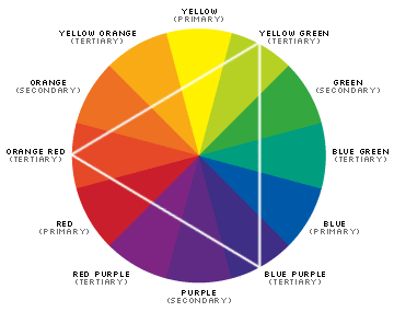
The colour wheel was invented through the basic theory of bending the spectral range of light into a circle containing seven different colours.
Since the invention of the colour wheel, artists have agreed (no mean feat!) that it represents the easiest way to choose complimentary colours. Within the colour wheel there are three classes of colour:
Primary: These are believed to be the fundamental three colours. They cannot be created by combining any other colours on the wheel, and they form the basis for all other colours.
Secondary: Secondary colours are made with the following formula:
Primary+Primary=Secondary, for example:
Red + Blue = Violet
Purple, Red + Yellow = Orange
Blue + Yellow = Green
Secondary colours lie between the primary colours.
Tertiary: Tertiary colours are created with this formula: Primary+Secondary=Tertiary
Using Triads to Select Colour Schemes
Triads are colour schemes that are connected within the colour wheel by a triangle. Using the RGB hex value, you can easily create complementary colour schemes by shifting the values around in groups of two, like this: RRGGBB, BBRRGG, GGBBRR
Line
Lines are basically a combination of points packed in together to form a single object -- the line. Lines can be straight, curved or irregularly shaped.
The most common use of line is to control the flow, direction and speed of the viewer's eye. Vertical lines will stop the person's eye, and give a sensation of mass and volume. They can also convey power and strength.
Horizontal lines influence rest and relaxation, while diagonal lines are dynamic and active. Line has several variables that we as designers can use to cause different effects, including:
- size
- shape
- position
- direction
- number
- interval
- density.
Mass
Any 2-dimensional object is called a shape, and any 3-dimensional object that has height, width, and depth is called a form. But don't be fooled! A design element that appears on-screen to have the 3 dimensions is only an illusion of form -- you have to be able to physically move an object around for it to truly be a form.
Most often mass is used for composition and to create patterns, though it can also be used to create an illusion of movement and rhythm through repetition. And by creating a smaller object next to a larger object, you can create the illusion of depth and perspective.
Movement
Movement is the element of design that defines direction and motion. When you want to lead a person to a specific area of a Website, artwork or design, you can use movement within the object to guide them there. Many designers overlook this element by using movement to lead the viewer's eye off the screen (as is quite frequently seen in Flash design). But if you want a person to focus on specific content, or a particular element, this isn't the way to go about it!
If you decide to use movement within your design (animation, and motion blur are 2 examples) then it is important not to use too much -- subtlety is the key here. A page full of movement becomes disorienting to the viewer as they try to follow the animation. Even flashing text, for example, has motion, so be very critical when you review pages that contain any moving elements at all.
Space
Space is any area between and around objects -- the space around any object is called negative space. Used together, space and negative space can also give an illusion of depth.
Negative space is just as important as space -- it will often give direction by leading the eye into positive space. So finding the balance between the use of negative space and positive space is what will make an image look "right".
Space can also be suggested by the use of tone, colour and the linear perspective of overlapping planes.
Texture
There are two types of texture: tactile texture (which is texture that you can physically touch), and visual texture.
I'm going to ignore texture as an element of art (sculpture, architecture and the like), and focus on visual texture as it has more relevance to us as Web designers. So when I say "texture", I'm referring to visual texture -- not tactile texture.
Visual texture relates to any 2-dimensional image, be it print, painting or on screen. It's texture that you can see, but not touch. It has the ability to look rough or smooth, wet or dry, hard or soft, shiny or matte, slick or sticky, slippery, abrasive, coarse or porous -- just to name a few!
Texture is used to enhance the realism of an image, which explains why most 3-d game designers focus a lot more on texture now than they did years ago, and why games seem more realistic. Texture has the advantage that it can trigger in our minds an association between what we see, and the resulting feeling generated by that image. We can then recall those same feelings when we see that texture again.
Texture also adds contrast and depth, along with direction and interest. Look at any object close up that has a rough texture, then put it down and move away from it. The texture will be less obvious, and less likely to arouse your sense of touch.
This same approach should be taken when using visual texture. If you want an image to appear to be close to the viewer, add more texture to it, and if you want the image to appear to be further away, reduce the texture.
Value
Value deals with colour -- more specifically, the lightness or darkness of colour. Like texture, value can be used to bring objects closer, or make them seem more distant -- add a higher value contrast to bring them closer, and a duller contrast to push them further away.
Value can also be used to give focus to certain areas and to make others seem less important.
Nick Mullen has been researching affiliate programs for the last 6 months and is currently developing a resource for merchants and affiliates who want to maximise their affiliate space.


No comments:
Post a Comment